Browser Rendering Pipeline
Introduction
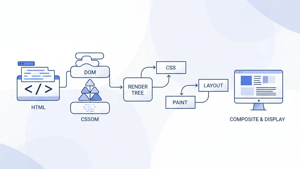
HTML, CSS is foundation building block use to build visual experience on the web. Understand how browsers convert text into a visual form, is not only a very crutial aspect of web development, but also a required knowledge to build high performance visual.
In this article, we would try to explain the journey from raw text of HTML, CSS all the way to be visual as pixels on the screen, which is of course has multiple immediate steps involved.
To be more practical, we would examine the below demo, to understand the step it’s required to rendering the animation, and what is the different between methods.
<div class="container"> <div class="content">content</div></div><div> <label> <input type="checkbox" id="with_transition" /> <span>with smooth transition</span> </label></div><div> <button id="animate">animate</button> <button id="reset">reset</button></div>/* moving */.container.with_transition.animate .content { transform: translateX(50px);}
.container:not(.with_transition).animate .content { left: 50px;}
/* just for coloring */.container.with_transition .content { background-color: lightcyan; color: black;}
.container { padding: 10px; background-color: lightgrey; position: relative;}
.content { display: inline-block; padding: 10px; background-color: grey; color: white; position: relative;}window.onload = () => { const $container = document.querySelector(".container"); const $animate = document.querySelector("#animate"); const $reset = document.querySelector("#reset"); const $with_transition = document.querySelector("#with_transition");
$animate.onclick = () => { if ($container.classList.contains("animate")) { $container.classList.remove("animate"); } else { $container.classList.add("animate"); } };
$with_transition.oninput = () => { if ($with_transition.checked) { $container.classList.add("with_transition"); } else { $container.classList.remove("with_transition"); } };
$reset.onclick = () => { $container.classList.remove("animate"); };};Parsing
HTML Parsing
In the HTML parsing step, the browser takes the raw HTML content and constructs the Document Object Model (DOM) tree. The following visualization illustrates the structure of the DOM based on our example HTML:
This structure describes how the div.container holds everything else, including the div.content, a label element with a checkbox, a descriptive span, and the two buttons for animation control.
CSS Parsing
During the CSS parsing stage, the browser processes CSS styles to construct the CSS Object Model (CSSOM). We can visualize the display properties of the important elements as follows:
Each displayed property showcases how elements will be laid out on the page. The .container is a block-level element, while .content is an inline-block, providing specific behavior and layout characteristics.
Style and The Rendering Tree
Combining the DOM and CSSOM leads to the creation of the Rendering Tree (sometimes called the Layout Tree). This tree, is browser-internal data structure, represents what elements need to be rendered on the screen along with the corresponding computed styles.
Steps to Create the Rendering Tree
Step 1. Traverse the from the root of DOM, recursively to identify visual elements. There are some nodes that will be ignored as an result not being part of the visual render tree, including:
-
Nodes that are not visible (for example, script tags, meta tags, and so on), and are omitted since they are not reflected in the rendered output.
-
Nodes that are hidden using CSS and are also omitted from the render tree
Step 2. Create or update the corresponding Render Tree node that links back to the original DOM node.
Step 3. Calculate the Computed Styles for each DOM node and associate them with both the DOM node and the Render Tree node.
Computed Style
The computed style is the final style that gets applied to each element, taking into account styles from various sources.
- Multiple Sources of Style: Styles can come from several places, including:
- Inline Styles: Styles defined directly on the elements via the
styleattribute. - Internal Styles: Styles defined within
<style>tags in the HTML document. - External Stylesheets: Styles applied via linked CSS files.
- User Agent Styles: Default styles provided by the browser if no other styles are specified.
- Inline Styles: Styles defined directly on the elements via the
<!doctype html><html lang="en"> <head> <!-- external styles --> <link rel="stylesheet" href="styles.css" />
<style> /* internal styles */ .text { color: blue; font-size: 20px; } </style> </head> <body> <!-- inline styles --> <h1 class="text" style="color: red; font-weight: bold">Hello, World!</h1>
<h1>Hello, World!</h1> <div class="text">Hello, World!</div> </body></html>h1 { font-weight: bold;}.text { font-family: "Atkinson", sans-serif;}-
Order of Style Overriding: When multiple styles are applicable to an element, CSS follows a specific order to determine which style takes precedence:
- Inline Styles have the highest specificity. They override styles from stylesheets.
- Internal CSS comes next. It overrides any styles from external stylesheets.
- External Stylesheets have lower specificity than inline and internal styles but can still affect styles depending on the order of the linked stylesheets.
- User Agent Styles are the default styles applied by the browser and have the lowest precedence.
-
Cascade and Specificity: In cases where multiple rules could apply, the cascade determines the applicable style based on specificity and importance. Further details of this topic would be discuss in a separate topic, since it’s long and complex. Or you could learn more in the document of mozilla
Final Computed Styles
The computed style contains all the resolved values of CSS properties necessary for rendering, ensuring that each element appears as designed on the screen. By understanding the sources and overriding logic of styles, developers can create more predictable and maintainable CSS in their projects.
Layout
Before the paint step, the layout process takes place.
Layout is the step where the browser calculates the size and position of every visible element in the rendering tree. It determines where elements will appear on the screen based on their dimensions, styles, and the structure defined by the HTML and CSS.
Reflow is any subsequent size and position determination of any part of the page or the entire document.
The first time the size and position of each node is determined is called layout. Subsequent recalculations of layout are called reflows.
<!doctype html><html lang="en"> <head> <meta charset="UTF-8" /> <meta name="viewport" content="width=device-width, initial-scale=1.0" /> <title>Layout example</title> <style> body { margin: 0; /* Resetting margin for body */ padding: 0; /* Resetting padding for body */ background-color: lightyellow; } .outer { width: 70%; background-color: lightgrey; padding: 10px; position: relative; /* This sets the positioning context */ } .outer::before { content: "outer"; } .inner { width: 50%; padding: 10px; background-color: lightblue; position: fixed; /* This positions to outer element */ top: 20px; /* 20 pixels from the top of the outer div */ left: 25%; /* Positioned to the center of the outer div */ } .inner::before { content: "inner"; } </style> </head> <body> <div class="outer"> <div class="inner"></div> </div> </body></html>- Outer Element (
.outer):- The
.outerdiv is assigned a width of 70% of its containing block (the body), and it has a background color of light grey. - The positioning is set to
relative, which means that it will be placed according to where it naturally fits in the document flow.
- The
- Inner Element (
.inner):- The
.innerdiv has a width of 50% of its parent (.outer), and its background color is light blue. - It is positioned using
absolute, which means it will be positioned relative to the nearest positioned ancestor (in this case, the.outerdiv). - The
top: 20px;property means it will be positioned 20 pixels from the top of the.outerdiv. - The
left: 25%;property positions it 25% from the left side of the.outerdiv, centering it within this outer div.
- The
After determining the positions of both elements, the browser prepares to paint the pixels on the screen. The .outer div will be displayed first, followed by the .inner div at the calculated position.
The positions and dimensions calculated during the layout phase allow the browser to know precisely where and how to paint each element. As the computed positions are finalized, these nodes in the rendering tree prepare for the next critical stage: painting.
Paint
With the layout information in hand, the browser takes the information generated from the rendering tree, including the positions, dimensions, and order of appearance of each node to converts each node to actual pixels on the screen.
Layers
To ensure repainting can be done even faster than the initial paint, the drawing to the screen is generally broken down into several layers. This way can be visually updated independently by a separate thread There are specific properties and elements that instantiate a layer, including:
<video><canvas>- any element which has the CSS properties:
- opacity
- 3D transform
- will-change
- filter
position: fixedorstickywithz-indexstacking- scrolling elements:
overflow: scrollorauto - a few others that create new stacking or compositing contexts Each of these nodes — along with their descendants — will be painted onto their own layer, unless a descendant independently qualifies for its own layer.
Rasterize
Once the layers are determined and the paint commands are ready, the browser rasterizes each layer.
Rasterization is the process of converting vector-like paint instructions (such as “draw a rectangle here” or “render this text at 14px”) into actual bitmaps or GPU textures — the raw pixel data the GPU can work with.
This step often happens on a separate raster thread, off the main thread to keep the UI responsive. Modern browsers use GPU-accelerated rasterization, meaning the drawing commands are executed directly into GPU memory.
The result of rasterization is one or more tiles (smaller bitmap chunks), which make partial updates and scrolling more efficient.
Composite
When multiple layers overlap or interact, the browser must composite them to produce the final image on the screen.
Compositing is handled by the compositor thread, which uses the GPU to:
- blend the layers in the correct z-order,
- apply transforms (translate, scale, rotate),
- adjust opacity, filters, and masks, and merge everything into the final frame buffer.
Because each layer is already rasterized into GPU memory, the compositor can redraw or animate them independently — without re-running layout or paint. That’s what allows smooth 60 FPS animations for properties like transform and opacity.
As the page continues to load assets or DOM changes occur, reflows can trigger repaints and occasionally re-rasterization, followed by re-compositing — the final merge step that brings everything to the screen in real time.
Conclusions
By understanding the entire rendering pipeline, developers can optimize performance and improve the user experience on the web.